


UCSF Institute for Neurodegenerative Diseases
Graphics and Identity
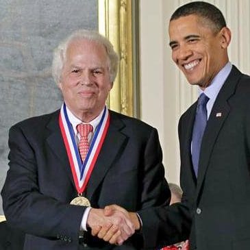
Nobel Prize winner, Stanley B. Prusiner, MD, Director for UCSF Institute for Neurodegenerative Diseases, ask me to design a logo for the institute. During our first meeting, Dr. Prusiner outlined his ideas and expectations on how the logo should appear. He proceeded to describe the work the institute does and how the logo should include cerebral neurons. After several failed attempts to design a logo that looks like neurons, I presented a concept that was, in my words, the exact opposite of what he was trying to achieve. I explained that instead of complexity, we should aim for simplicity.
“Design theory has proven time and time again; the simplest solution is the hardest to find.”
The current IND logo is conceptually simple. By removing parts of each letter, I conceptually express the degenerative nature of their work. While at the same time, the logo looks futuristic and high-tech.
Dr. Prusiner was thrilled and excited about his new logo, especially since several designers had previously made many unsuccessful attempts. However, I believe the position of the client caused their failer. In this case, a brilliant Nobel Prize-winning, world-renowned Medical Doctor who knew precisely the direction. But design theory has proven time and time again; the simplest solution is the hardest to find.