DMG America

Graphics and Identity

As a dental company, DMG America has delivered some of the most widely used and clinically successful dental products to North America. For the past 15 years, DMG America has worked with me on all facets of graphics and identity, products and packaging, exhibitions and installations, websites and digital experiences, advertising, and communications.

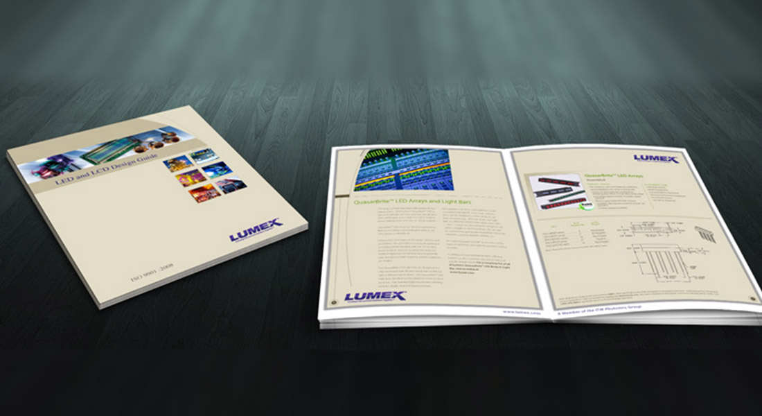
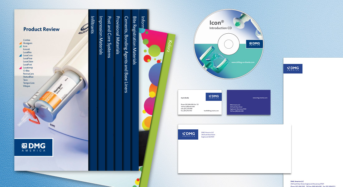
DMG America provided an exciting challenge for me. The company has several different products which require their own branding identity. However, since these products fall under the DMG brand, the problem was to maintain a cohesive look.

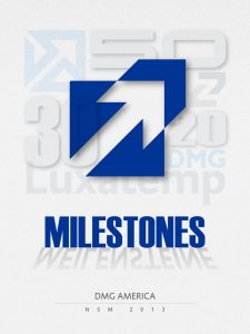
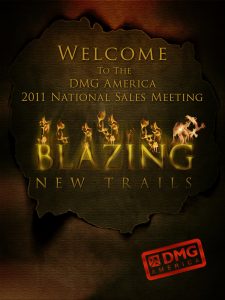
Another design challenge was DMG’s annual sales meeting held at a different place each year. Not only was the location changed, but each year a different theme was chosen.


” The company has several different products which require their own branding identity”


Vera Wang

Websites & Digital Experiences

Vera Wang needed an intranet system to monitor her design collections from a mobile device. Executive Vice President, Bill Mitchell, and Vice President of IT, Marc Alcegaire meet with me to discuss options, and I proposed the development of a highly responsive, secure website.

Highly-responsive vs. responsive: A responsive site is designed to adjust the UX depending on whether the browser is mobile or desktop. But a highly-responsive website focuses mostly on mobile devices. In Vera Wang’s case, it was designed to be viewed mainly on her iPad.

“The principal challenge was to organize Vera Wang’s 1,500+ global collections, and subcategorize by each season “

The principal challenge was to organize Vera Wang’s 1,500+ global collections, subcategorize by season, and create a coding system so the site could be database driven and dynamically populated with content. After fine-tuned a naming convention, each photo was named using the code, which allowed Vera to search and view current and past collections with ease.

W


Lorenzo Enterprises
O’Cafe Essence Water

Consumer Packaged Goods

Lorenzo Enterprises is a food and beverage merchant. The company recently developed coffee-flavored essence water branded as O’Cafe.

The coffee-flavored beverage offered a unique branding opportunity because it was first to market. My creative branding strategy was to capture the design essence of coffee beans with the warm feeling you get sitting in today’s lovely cafe’s.

There were some recommendations from management to create a label that
had a more modern feel. Still, I reasoned that coffee-flavored essence water should characterize the experience of drinking coffee in a cafe as much as possible.

“coffee-flavored essence water should characterize the experience of drinking coffee in a cafe “


Graphic Design Annual
& AGDA Invitation

Art and Design

Graphic Design:usa is a monthly publication distributed nationally to 40,000 advertising and creative professionals. Each month I was tasked with creating a fresh and cutting edge design that would be viewed by virtually all of the top designers in the country. The challenge was exhilarating and pushed my creative talents to new heights.

Pictured here are the covers for 1995 Graphic Design Annual and the 1998 American Graphic Design Awards invitation. At the time, I was infatuated with numerical typography and was exploring creative interpretations and their spacial relationships. The art seemed appropriate since the subject matter included design submissions for that year.


“I was infatuated with numerical typography and
was exploring creative interpretations and their spacial relationships”


UCSF Institute for Neurodegenerative Diseases

Graphics and Identity

Nobel Prize winner, Stanley B. Prusiner, MD, Director for UCSF Institute for Neurodegenerative Diseases, ask me to design a logo for the institute. During our first meeting, Dr. Prusiner outlined his ideas and expectations on how the logo should appear. He proceeded to describe the work the institute does and how the logo should include cerebral neurons. After several failed attempts to design a logo that looks like neurons, I presented a concept that was, in my words, the exact opposite of what he was trying to achieve. I explained that instead of complexity, we should aim for simplicity.

“Design theory has proven time and time again; the simplest solution is the hardest to find.”

The current IND logo is conceptually simple. By removing parts of each letter, I conceptually express the degenerative nature of their work. While at the same time, the logo looks futuristic and high-tech.

Dr. Prusiner was thrilled and excited about his new logo, especially since several designers had previously made many unsuccessful attempts. However, I believe the position of the client caused their failer. In this case, a brilliant Nobel Prize-winning, world-renowned Medical Doctor who knew precisely the direction. But design theory has proven time and time again; the simplest solution is the hardest to find.