


Vera Wang
Websites & Digital Experiences
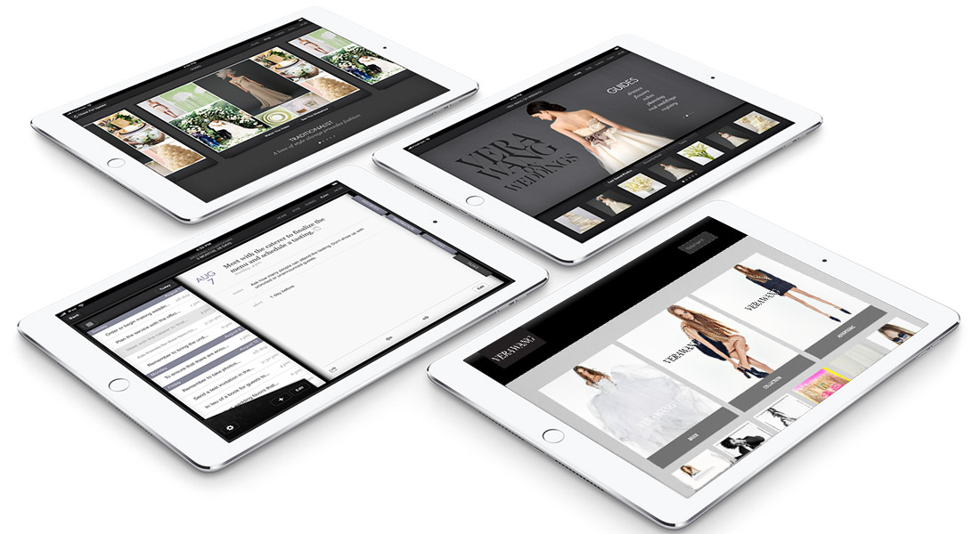
Vera Wang needed an intranet system to monitor her design collections from a mobile device. Executive Vice President, Bill Mitchell, and Vice President of IT, Marc Alcegaire meet with me to discuss options, and I proposed the development of a highly responsive, secure website.
Highly-responsive vs. responsive: A responsive site is designed to adjust the UX depending on whether the browser is mobile or desktop. But a highly-responsive website focuses mostly on mobile devices. In Vera Wang’s case, it was designed to be viewed mainly on her iPad.
“The principal challenge was to organize Vera Wang’s 1,500+ global collections, and subcategorize by each season “
The principal challenge was to organize Vera Wang’s 1,500+ global collections, subcategorize by season, and create a coding system so the site could be database driven and dynamically populated with content. After fine-tuned a naming convention, each photo was named using the code, which allowed Vera to search and view current and past collections with ease.
W